First released: 10.01.2010
Current version:2.0.0.0
Last Update: 07.01.2012
Greetings
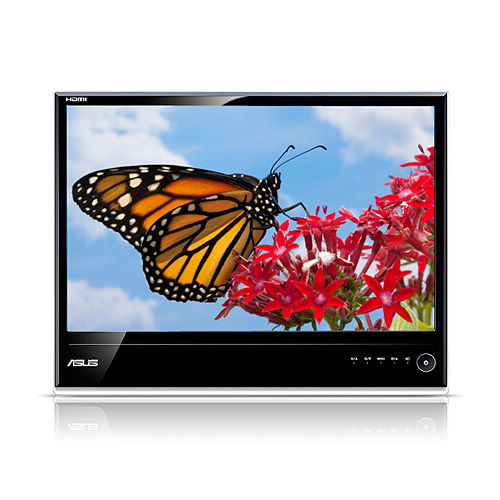
When i search for a new monitor i discover this wonderful monitor and i must create a skin that look like this fine piece of design!
Link
This skin have to live with the well known limitation's from Dark/Black Skin's,
but there is still hope for some fixes in the next MM release (like we can read in the forum)
So and here it is
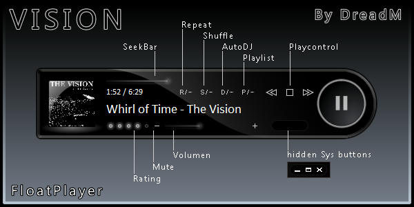
FloatPlayer:
Vision Theme:
Extensions: SI , LV , MR
Download
Theme:
Vision.mmip
Extensions:
Monkey Rok 5 skins link
LV Vision v 1,0,0,1.mmip Skin forLyrics Viewer by gege
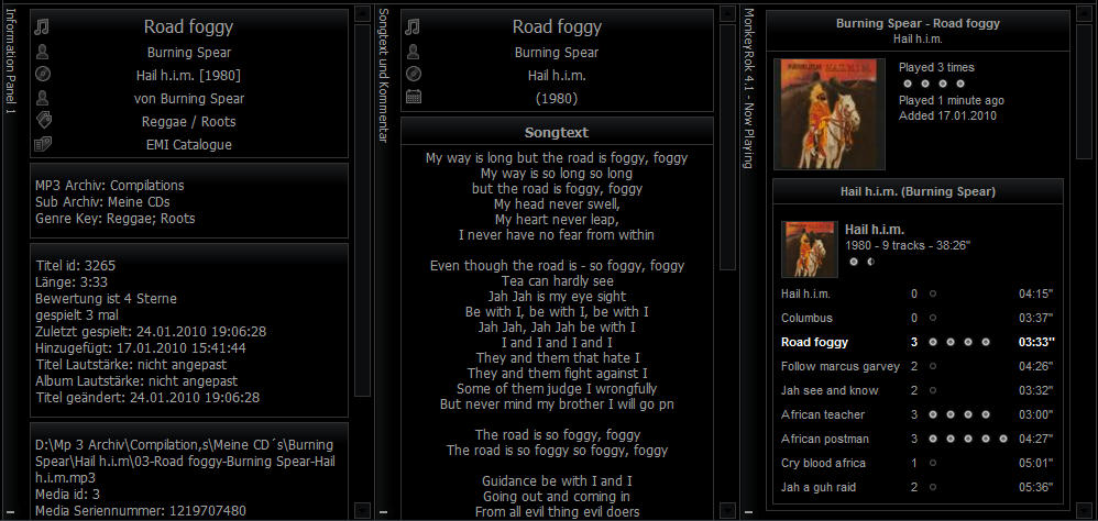
SI Vision v 1,0,0,0.mmipSkin forSong Information panel by k_r_eriksson
final release (24.01.2010)
Fixes / News
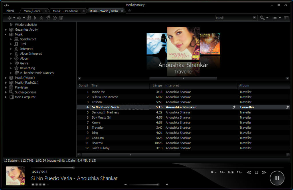
Version 2.0.0.0
update for MM4
add chrome style tabs
minor changes on theme ( now with real scroll bars)
add new video player
Version 1.1.0.0
Theme:
change focused text color from edit menus
change background from search bar
fix disable checkbox image ( MagicNode )
change the default checked checkbox image
microPlayer:
fix missing shuffle button states images
fix graphical bug at play control buttons
at bigger press area to the close and maximize buttons
Version 1.0.0.0
Theme:
changed Rating icons
changed close buttons from panel
changed color from focused text in drop down list
fix border behavior from small windows
rid off MM icons in all menus
Player:
fix text cut off (Xp)
added Seek bar background
changed text color
FloatPlayer:
added hidden sys buttons area (minimize,maximize,close) under playcontroll
Note:
The Icon Set include some of gege's dark/black converted Silc icons (thanks for that
i hope you like the skin
when you have any suggestion or advices let me know!
Enjoy


