Page 5 of 18
Re: Vision Skin (beta)
Posted: Thu Jan 28, 2010 4:30 pm
by gpzbc
This is a bug in MediaMonkey, not the Vision skin. It was discussed quite a bit on pages 2 and 3 of this forum. Hopefully it will be fixed in the next build of MM.
Re: Vision Skin v 1.0.0.0
Posted: Thu Jan 28, 2010 5:54 pm
by FEB
oops, sorry about that. I don't usually have a skin with the art there, so I hadn't noticed before. Cheers for pointing it out.
Re: Vision Skin v 1.0.0.0
Posted: Thu Jan 28, 2010 7:42 pm
by gpzbc
No worries. We're all noticing it at different times. Hopefully that will all end soon!

Re: Vision Skin (beta)
Posted: Thu Jan 28, 2010 8:44 pm
by Mizery_Made
gpzbc wrote:This is a bug in MediaMonkey, not the Vision skin. It was discussed quite a bit on pages 2 and 3 of this forum. Hopefully it will be fixed in the next build of MM.
Since the quoted comment regarding this bug, it's been fixed. We're just waiting on a build with the fix to be released.
Re: Vision Skin v 1.0.0.0
Posted: Sat Jan 30, 2010 4:51 am
by dypsis
I like the square boxes for scrolling up and down on Lyrics and Comment Viewer and MonkeyRok.
But MediaMonkey has a Plus sign (+) for doing this.
I think it would be nice if MediaMonkey also had the square box for scrolling up and down.
I am not fond of the Plus sign (+).
It would also match Lyrics and Comment Viewer and MonkeyRok.
Re: Vision Skin v 1.0.0.0
Posted: Sat Jan 30, 2010 6:39 am
by DreadM
Greetings
Hm, maybe?
Well the scrollbars from LV and Mr are just the result from the limitations of the script skin engine,and why to implant this limitations to the MM skin?
If i can choose i would prefer to implant the MM scroll bars into the script skins! but not possible.

btw 1,
here is a style.css code for the Lyrics Viewer with smaller headers and text and the same font family like the MR skin:
Code: Select all
html {
    scrollbar-base-color:#000000;

    scrollbar-highlight-color: #333333;
    scrollbar-shadow-color: #333333;
    scrollbar-face-color: #0D0E10;

    scrollbar-3dlight-color: #000000;
    scrollbar-arrow-color: #000000;
    scrollbar-track-color: #000000;
    scrollbar-darkshadow-color: #000000;
	}

body {
    font:.7em Geneva, Arial, Helvetica, sans-serif;
    background:#000000;
	color:#9f9f9f;
    margin:4px;
    }

.header_content {
	background-image:url("header.jpg");
	background-repeat:repeat-x;
	border: 1px solid #333333;
	}

h1,h2,h3,h4,h5 {
    font-weight:normal;
	color:#9f9f9f;
	clear:both;
    margin:3px;
	padding:2px 20px 2px 20px;
	font-size:9pt;
	text-align: center;
	}
h1 {font-size:12pt;
    background:url('Titel.png') no-repeat 0px 4px 0px 0px;
    }	                                                    /*  Song Title  */
h2 { background:url('Artist.png') no-repeat top left;
	}                                                       /*  Artist      */
h3 { background:url('Album.png') no-repeat top left;
	}                                                       /*  Album       */
h4 { background:url('Year.png') no-repeat top left;
	}                                                       /*  Year        */
h5 {background:url('Publisher.png') no-repeat top left;
	}	                                                    /*  Composer    */
.box_header {
    display:block; border:1px solid #333333;
	background-image:url("header.jpg");
	background-repeat:repeat-x;
    margin:-4px 0px -1px 0px;
	padding:4px 1px;
    font:8pt Geneva, Arial, Helvetica, sans-serif;
	font-weight:bold; }

.lvbody {
    padding:6px 0px;
	margin:4px 0px 0px 0px;
	/*border: 1px solid #333333;*/
	text-align: center;
	font-weight:bold;}

p  { font:8pt Geneva, Arial, Helvetica, sans-serif;                   /* Lyrics and Comment content */
    padding:4px 10px 13px 10px;
	margin:0px 0px 10px 0px;
	text-align: center;
    border: 1px solid #333333;}

a  { color:#888888; }
btw 2,
on my way to understand this css and html stuff better , i make some modifications to the MR skin ,looks like this:

as you noticed i change the first info box layout
and separate all available boxes and put a icon in front
What you think about?
I'm interest if somebody need or use the played,lastplayed,and added info ,
in my personally MR skins i delete this entry's, because i don't need .
I'm wondering if i can make this also in the public versions and what people think about?
Re: Vision Skin v 1.0.0.0
Posted: Sat Jan 30, 2010 10:09 am
by Vyper
You could always post both styles so people could choose the one they like best.

Re: Vision Skin v 1.0.0.0
Posted: Sat Jan 30, 2010 11:29 am
by gpzbc
I like the new MonkeyRok style where the rating icon is on the bottom of the list rather than the top.
As far as the other MonkeyRok items, I don't use the "date added" but I definitely use the "number of times played" and the "last played date". I'd like to keep those if possible.
And for what its worth, I agree with you about the scrollbars. I prefer the MM plus sign over the MR square boxes. Sorry dypsis.
Thanks!
Re: Vision Skin v 1.0.0.0
Posted: Sat Jan 30, 2010 7:28 pm
by dypsis
DreadM wrote:Greetings
Hm, maybe?
Well the scrollbars from LV and Mr are just the result from the limitations of the script skin engine,and why to implant this limitations to the MM skin?
If i can choose i would prefer to implant the MM scroll bars into the script skins! but not possible.
btw 1,
here is a style.css code for the Lyrics Viewer with smaller headers and text and the same font family like the MR skin:
Code: Select all
html {
    scrollbar-base-color:#000000;

    scrollbar-highlight-color: #333333;
    scrollbar-shadow-color: #333333;
    scrollbar-face-color: #0D0E10;

    scrollbar-3dlight-color: #000000;
    scrollbar-arrow-color: #000000;
    scrollbar-track-color: #000000;
    scrollbar-darkshadow-color: #000000;
	}

body {
    font:.7em Geneva, Arial, Helvetica, sans-serif;
    background:#000000;
	color:#9f9f9f;
    margin:4px;
    }

.header_content {
	background-image:url("header.jpg");
	background-repeat:repeat-x;
	border: 1px solid #333333;
	}

h1,h2,h3,h4,h5 {
    font-weight:normal;
	color:#9f9f9f;
	clear:both;
    margin:3px;
	padding:2px 20px 2px 20px;
	font-size:9pt;
	text-align: center;
	}
h1 {font-size:12pt;
    background:url('Titel.png') no-repeat 0px 4px 0px 0px;
    }	                                                    /*  Song Title  */
h2 { background:url('Artist.png') no-repeat top left;
	}                                                       /*  Artist      */
h3 { background:url('Album.png') no-repeat top left;
	}                                                       /*  Album       */
h4 { background:url('Year.png') no-repeat top left;
	}                                                       /*  Year        */
h5 {background:url('Publisher.png') no-repeat top left;
	}	                                                    /*  Composer    */
.box_header {
    display:block; border:1px solid #333333;
	background-image:url("header.jpg");
	background-repeat:repeat-x;
    margin:-4px 0px -1px 0px;
	padding:4px 1px;
    font:8pt Geneva, Arial, Helvetica, sans-serif;
	font-weight:bold; }

.lvbody {
    padding:6px 0px;
	margin:4px 0px 0px 0px;
	/*border: 1px solid #333333;*/
	text-align: center;
	font-weight:bold;}

p  { font:8pt Geneva, Arial, Helvetica, sans-serif;                   /* Lyrics and Comment content */
    padding:4px 10px 13px 10px;
	margin:0px 0px 10px 0px;
	text-align: center;
    border: 1px solid #333333;}

a  { color:#888888; }
btw 2,
on my way to understand this css and html stuff better , i make some modifications to the MR skin ,looks like this:
as you noticed i change the first info box layout
and separate all available boxes and put a icon in front
What you think about?
I'm interest if somebody need or use the played,lastplayed,and added info ,
in my personally MR skins i delete this entry's, because i don't need .
I'm wondering if i can make this also in the public versions and what people think about?
Thanks.
Re: Vision Skin v 1.0.0.0
Posted: Mon Feb 01, 2010 10:46 am
by rrfpacker
For What It's Worth; I like the Monkey Rok changes. As was posted earlier, since you are "playing" around and coming up with different ways for your skins to look, any and all postings of these is welcomed, then we get to choose.
Keep doing what you are doing, the skins and ideas are wonderful.
Re: Vision Skin v 1.0.0.0
Posted: Mon Feb 01, 2010 2:07 pm
by DreadM
Greetings
Thanks rrfpacker
the only problem i got is that i don't know relay how this Script Skin stuff works and what is possible , so i have to try out hours and hours

but when I'm satisfied with the MR skin i will post here.
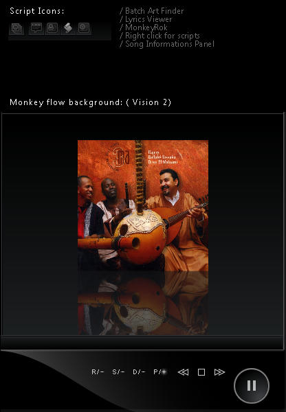
Here is the
Extended Vision pack, it's a zip file and contains different folders with backgrounds for monkeyflow and the original Player image and some script icons
( + MagicNodes icon)
looks like this:
please read the readme text inside the zip file and follow the instructions
all changes have to do manually
if you need more icons ,let me know and i look what i can do.
Download:
Extended Vision pack: v 1.0.0.0.zip
Enjoy
Re: Vision Skin v 1.0.0.0
Posted: Mon Feb 01, 2010 6:43 pm
by Mizery_Made
Neat-O! The script icons look great. I especially love "MagicNodes (B)."
That leaves me with only two script icons which don't match the skin. The trouble with them is, both use colors to differentiate from their states. Those are the Last.FM Scrobbler icon(s) and the Advanced Repeat one. Not sure there's much that could be done with them, since as stated, they use colors to indicate which mode they're in.
Only thing I could perhaps thing of, is instead of making the logo/emblem white with the backgrounds colored, instead making the backgrounds fit the color scheme and then use colors for the logos/emblems. Might be less intrusive that way, though that may actually make it stick out like more of a sore thumb. If you (or gege?) look into these two icons and brainstorm some ideas, cool, if not... still cool, cause you've already done more than should be expected by modifying the other Script icons.
Re: Vision Skin v 1.0.0.0
Posted: Mon Feb 01, 2010 8:00 pm
by gpzbc
Thank you. I'm enjoying the script icons.
Re: Square Black Boxes
Posted: Tue Feb 02, 2010 3:32 am
by dypsis
dypsis wrote:I like the square boxes for scrolling up and down on Lyrics and Comment Viewer and MonkeyRok.
But MediaMonkey has a Plus sign (+) for doing this.
I think it would be nice if MediaMonkey also had the square box for scrolling up and down.
I am not fond of the Plus sign (+).
It would also match Lyrics and Comment Viewer and MonkeyRok.
I have only just noticed that the square black boxes actually have black up and down arrows lol.

Re: Vision Skin v 1.0.0.0
Posted: Sat Feb 06, 2010 1:17 pm
by After using Vision for a Couple of Weeks
After using Vision for a Couple of Weeks I will say that it is the best skin yet ..... easy on the eyes and looks good AND it's functional.
I can only think of 3 ways to make it better:
When editing text there sometimes isn't enough contrast between the text and background.
The taskbar player needs a dedicated area to quickly bring up the current song panel OR it need to come up quicker.
The taskbar player restore button needs to be a little bigger for those with high res monitors (hard to hit)
Small suggestions
