Best looking skin of all.
Only thing I'd like changed are the play, stop, fwd/rwnd buttons to have the same "glassy" look as the track playing readout (circled in white) and to be larger by placing the 8 smaller playlist on/off, eq, shuffle, continuous playback, auto dj etc buttons (red arrown pointing left) to also be larger by placing them below the track playing read out & in between the eq light readouts (red arrow bottom middle pointing upward) & the star ratings area (2x8 long lay out seems perfect as that space has nothing there atm.)
Is it possible to do this myself without too much hassle?
Also I'd like to actually
see the timer, (Yellow & Red Arrows pointing down (should have both been red) as the font in the track info glassy screen readout is far too small (tbh I literally only saw it a second ago when looking harder at what was written and i've been using this skin for 2 or 3 months now) that and the time remaining need to be at least 3 times larger (slightly smaller than the track font itself & the album font could do with being larger) as well as the mp3 bit rate above the ratings stars (red arrow pointing down dar right). Go big.
Can I also edit this myself? (Adjusting the font percentage in skins options seems to change the main font as well which I'd like to stay the same.)
Lastly (whilst on a roll about font sizes.) the font size of the now playing info (right hand side,now playing tab, above top left of the now playing artwork image) is as good as unreadable, that needs doubling.
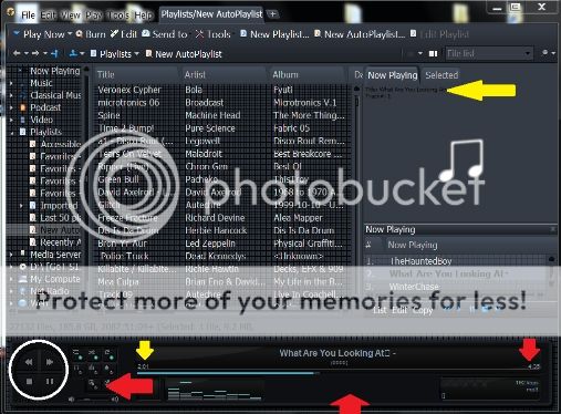
Other than it's great. (it's great anyway) It's the only skin i use.
Thanks for a great skin.
Best looking skin of all.
Only thing I'd like changed are the play, stop, fwd/rwnd buttons to have the same "glassy" look as the track playing readout (circled in white) and to be larger by placing the 8 smaller playlist on/off, eq, shuffle, continuous playback, auto dj etc buttons (red arrown pointing left) to also be larger by placing them below the track playing read out & in between the eq light readouts (red arrow bottom middle pointing upward) & the star ratings area (2x8 long lay out seems perfect as that space has nothing there atm.)
Is it possible to do this myself without too much hassle?
Also I'd like to actually [u]see[/u] the timer, (Yellow & Red Arrows pointing down (should have both been red) as the font in the track info glassy screen readout is far too small (tbh I literally only saw it a second ago when looking harder at what was written and i've been using this skin for 2 or 3 months now) that and the time remaining need to be at least 3 times larger (slightly smaller than the track font itself & the album font could do with being larger) as well as the mp3 bit rate above the ratings stars (red arrow pointing down dar right). Go big.
Can I also edit this myself? (Adjusting the font percentage in skins options seems to change the main font as well which I'd like to stay the same.)
Lastly (whilst on a roll about font sizes.) the font size of the now playing info (right hand side,now playing tab, above top left of the now playing artwork image) is as good as unreadable, that needs doubling.
[img]http://i1346.photobucket.com/albums/p681/AuralVirus/3421f3ee-14b4-424c-a997-35561f2028ec_zps39355bea.jpg[/img]
Other than it's great. (it's great anyway) It's the only skin i use.
Thanks for a great skin.